Curating Data for Impactful Insights
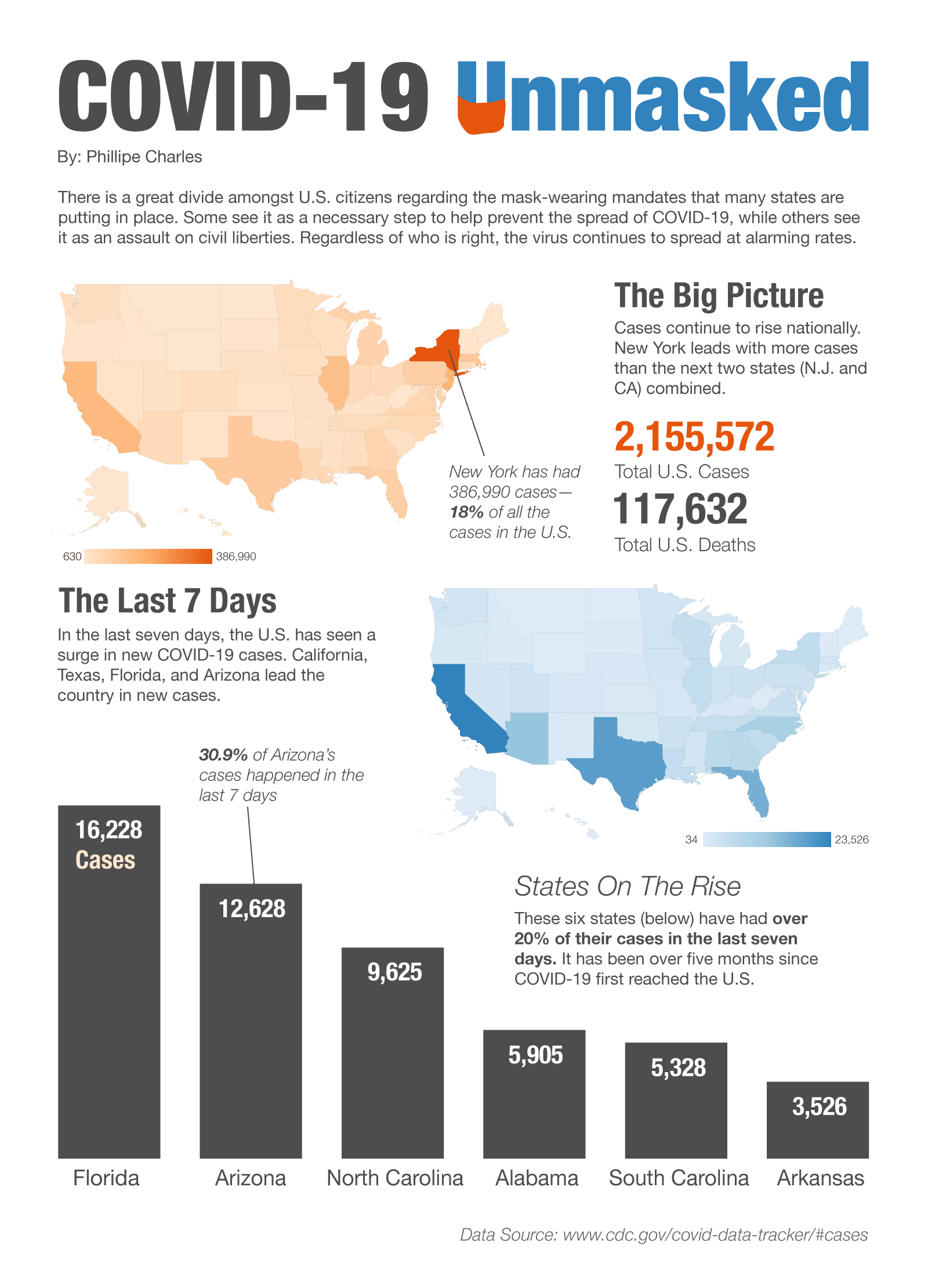
With an abundance of COVID-19 data available, it was essential to curate the information in a way that presented an unbiased story without any political agenda. I carefully narrowed down the data to highlight the big picture of total cases across the U.S. as well as new cases that had occurred within the last seven days. Diving deeper into the last seven days, I also wanted to show the states that had over 20% of their cases in the last seven days. This was used to help users understand where trends might be moving.
Designing a Clear Visual Representation
To effectively present COVID-19 data, I employed two choropleth maps to showcase the range of cases across different states, capturing both the overall numbers and the cases reported within the last seven days. This approach allowed users to gain a real-time understanding of the rapid surge in new cases, fostering full comprehension of the evolving situation. Additionally, I incorporated a bar chart specifically for states with over 20% of their cases occurring in the last seven days. By employing these visualizations, my aim was to communicate regional trends, identify areas of concern, and provide a holistic understanding of the COVID-19 landscape within the country.
Balancing Color and Design Cohesion
One of the key design considerations was managing the various colors introduced by the large choropleth maps. To ensure clarity and coherence, I strategically selected complementary blue and orange colors and subtly incorporated them into the overall design. This decision not only facilitated easy comprehension but also created a visually pleasing experience for users.
Empowering Users with Insights
The ultimate goal of this information visualization was to empower users to grasp the extent and impact of COVID-19 in the United States. By providing a visually engaging representation of the data, users could identify patterns, regional trends, and problem areas at a glance. This intuitive visualization aimed to enhance public understanding and contribute to informed decision-making during the pandemic.
Covid-19 Unmasked
In my journey as a Masters student in Digital Communication, I had the opportunity to create an impactful information visualization project centered around COVID-19. This portfolio piece showcases my design and information visualization decisions, aimed at distilling complex data into a clear and effective visualization that helps users understand the spread of the virus in the United States.
Project details
Date
July 2022
